The map you've been looking at your entire life is wrong. Africa is three times the size of the United States. Greenland is not bigger than Africa. Here's why maps lie — and what the most accurate one actually looks like.
Originally published November 3, 2019 · Updated May 2026
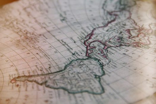
The history of world maps is fascinating and transformative. The world map has changed a lot throughout history — from the early days of Ptolemy in Egypt to the emergence of modern world maps at the end of the 18th century. But do we actually use the right map these days? Is it the most accurate one?
Perhaps in the future, a new world map will take over and become the global consensus. In fact, that future might already be here.
Why the Map You Grew Up With Is Wrong
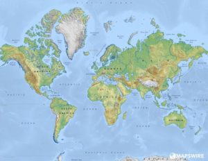
The map pretty much everyone is familiar with is called the Mercator Projection, first created by Flemish cartographer Gerardus Mercator in 1569. It was revolutionary for its time — designed primarily for navigation, it allowed sailors to draw straight lines between two points and sail accurately along them. For that purpose, it was a masterpiece.
But here’s the problem: to flatten a sphere onto a rectangle, you have to stretch something. Mercator chose to stretch the areas near the poles. And that decision has quietly distorted the way the entire world thinks about geography for over 450 years.
One reason Europe sits at the center of the standard world map is also no accident — the map was first created in Europe, and European cartographers naturally placed themselves at the middle. Martin Waldseemüller drew the first recognizable world map in 1507, and that Europe-centric framing stuck.
The Numbers That Will Surprise You
The distortions in the Mercator map aren’t subtle. Here’s what the map gets badly wrong:
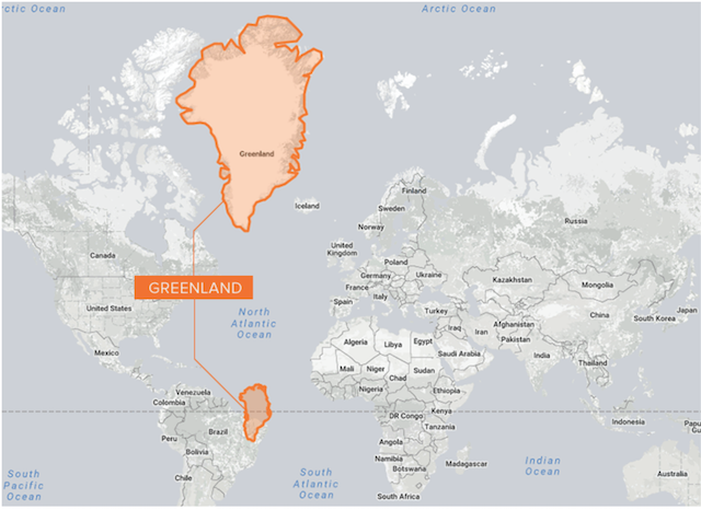
- Africa appears roughly the same size as Greenland on a Mercator map. In reality, Africa is about 14 times larger than Greenland. The entire continental United States, China, India, and much of Europe could fit inside Africa simultaneously.
- Russia looks like it dominates the globe. It is the world’s largest country by land area, but the Mercator map makes it appear nearly twice as large as it actually is relative to countries near the equator.
- Scandinavia appears larger than India on a standard map. India is actually three times larger.
- Alaska looks comparable in size to the continental United States. It is actually about one-fifth the size.
- Antarctica appears as a massive white continent stretching across the entire bottom of the map. In reality it is roughly the size of the United States and Mexico combined — not the enormous landmass the map implies.
The pattern is consistent: countries in the northern hemisphere — Europe, Russia, Canada — are visually inflated. Countries near the equator — most of Africa, South and Southeast Asia, Central and South America — are visually compressed.
This isn’t just a geographical curiosity. It has real consequences for how people perceive the relative importance of different parts of the world.
The Problem Goes Further: North Is Always Up
Have you ever stopped to ask why north is at the top of every map?
There is no scientific reason for it. There is no “up” in space. The Earth is a sphere floating in a vacuum, and north and south are arbitrary human designations. For most of human history, maps were drawn with south at the top — including early Islamic maps, which placed Mecca prominently. Maps oriented with east at the top were common in medieval Europe, which is where the word “orientation” actually comes from.
The convention of north-at-top became dominant largely because European cartographers in the Age of Exploration standardized it, and their maps spread globally along with European colonial influence. A map with south at the top would be just as geographically accurate — it would simply look strange to anyone raised on standard maps.
This matters because a map is not just a tool for navigation. It is also a mental model of the world. When Africa appears small and sits at the bottom of every map while Europe appears large and sits near the center, that shapes — subtly but persistently — how people think about power, importance, and geography.
The Attempts to Fix It
Cartographers have known about Mercator’s distortions for centuries, and there have been many serious attempts to build a better map. Each solves some problems while introducing others — because the fundamental challenge of projecting a sphere onto a flat surface is mathematically impossible to do perfectly.
The Gall-Peters Projection
Introduced in 1973 by Arno Peters (based on earlier work by James Gall), this map corrects the area distortions of Mercator. Countries are shown at their true relative sizes. Africa looks enormous. Europe looks appropriately modest. The problem is that to preserve area, the map distorts shape — countries near the poles appear stretched vertically, and those near the equator appear squashed horizontally. It’s more honest about size but less useful for understanding the actual shape of landmasses.
The Mollweide Projection
An elliptical map that preserves area across the whole globe. It’s widely used in scientific and demographic contexts where showing accurate proportions matters more than accurate shapes. Not ideal for everyday use — the curved edges make distances feel unintuitive — but a significant improvement for anything involving data visualisation by region.
The Winkel Tripel Projection
The National Geographic Society adopted this projection in 1998 as its standard map. It’s a compromise — it doesn’t perfectly preserve area or shape, but it minimizes both distortions simultaneously, producing a map that looks more intuitively “correct” to most viewers. It remains one of the most respected general-purpose world maps in use.
The Goode’s Homolosine Projection
Created by John Paul Goode in 1923, this one takes an unusual approach: it “peels” the globe like an orange, creating an interrupted map where the oceans are split to preserve the shape and size of the continents. Landmasses are extremely accurate. The ocean, however, becomes fragmented and nearly unusable for navigation. It’s a vivid illustration of the trade-offs involved.
The Boggs Eumorphic Projection
A lesser-known but elegant compromise that averages two other projections to minimize distortion across the board. Rarely seen in everyday use, but respected in academic cartography for its balance.
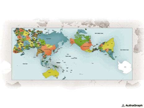
The AuthaGraph World Map — The Most Accurate Yet
The most ambitious attempt to solve all of these problems at once is the AuthaGraph World Map, created by Japanese architect Hajime Narukawa and first introduced in 1999, with a refined version released in 2016.
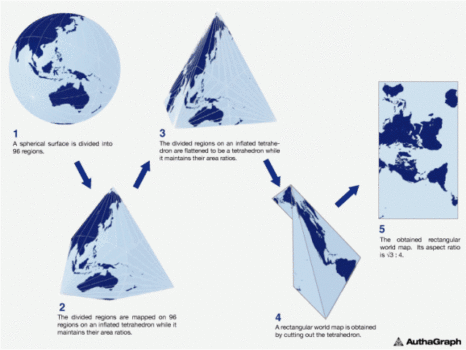
The AuthaGraph takes a fundamentally different approach. Rather than trying to project a sphere directly onto a flat rectangle, Narukawa first divides the globe into 96 triangular regions and transfers them onto a three-dimensional tetrahedron — essentially a four-sided pyramid. The tetrahedron is then unfolded into a flat surface.
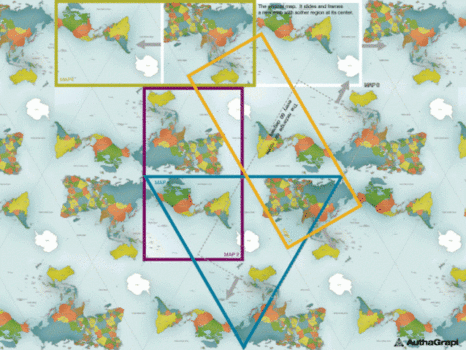
The result is a map that can be tiled in any direction without visible seams, meaning there is no fixed center, no fixed top, and no forced edges. You can choose any region to place at the center of your map. The oceans and continents appear in their correct relative proportions. Antarctica is shown accurately. The Arctic is shown accurately. No continent is dramatically inflated or compressed.
In 2016, the AuthaGraph World Map won the Good Design Grand Award in Japan — the country’s most prestigious design prize — recognizing it as a significant breakthrough not just in cartography but in how humans represent their world.
It isn’t perfect. The shapes of continents are slightly distorted compared to the real world, and the unusual orientation takes some getting used to. But for area accuracy and the elimination of polar distortion, it is widely considered the most scientifically rigorous flat map ever made.
What makes this map so special? The AuthaGraph map divides the globe into 96 regions and transfers them to a tetrahedron shape. This world map can be tiled in any direction without visible seams, and with the Authagraph map, you can choose various regions at its center, which eventually creates a much more proportionally accurate world map.
Your Phone Map Has the Same Problem
Here’s something most people don’t realize: Google Maps, Apple Maps, and virtually every digital mapping app you use runs on a variant of the Mercator projection.
The standard for web mapping is called Web Mercator (technically EPSG:3857), adopted in the mid-2000s because it made tile-based digital maps computationally simple and efficient to render. The same distortions that Gerardus Mercator introduced in 1569 are baked into the maps on your phone today.
Google did make one quiet improvement: at zoom levels showing the whole Earth, Google Maps now renders countries as a 3D globe rather than a flat projection. If you zoom all the way out in Google Maps, you’ll notice Greenland shrinks to its proper size and Africa expands. But the moment you zoom in for navigation, you’re back on Mercator.
The lesson here is that the most accurate map and the most useful map are not always the same thing. Mercator remains dominant in digital navigation because its mathematical properties make straight-line routes easy to calculate — the same reason sailors used it in the 16th century. Accuracy and utility are different problems.
Does It Actually Matter?
It’s a fair question. In an age of GPS, satellite imagery, and real-time navigation, does it really matter which projection we use on a classroom wall?
The argument that it does goes like this: maps are not neutral. They are one of the most powerful tools humans use to understand the world, and the images we grow up with shape our intuitions in ways we’re barely conscious of. A child who spends 12 years looking at a map where Africa is small and Europe is large absorbs an implicit message about the world — one that doesn’t match reality.
Several countries have already acted on this. In 2017, Boston public schools switched from the Mercator projection to the Gall-Peters projection in classrooms, explicitly to give students a more accurate sense of the relative size of continents. The decision was controversial but sparked a global conversation about which map children should be learning from.
The AuthaGraph map is now used in some Japanese schools. Whether it — or something like it — eventually becomes the global standard remains to be seen. But the conversation is happening, and that’s new.
FAQ
What is the most accurate world map?
The AuthaGraph World Map, created by Hajime Narukawa, is currently considered the most accurate flat representation of the Earth. It minimizes distortions of both area and shape by projecting the globe via a tetrahedron before unfolding it flat.
Why is the Mercator map still used if it’s inaccurate?
Mercator’s projection preserves angles, which makes it ideal for navigation. Sailors could plot a straight-line course and follow it accurately. Modern digital maps inherited this property because it makes tile rendering and route calculation computationally efficient. Accuracy and utility are different goals.
Is Africa really that much bigger than it looks?
Yes. Africa is the world’s second-largest continent and covers about 30.4 million square kilometres. On the Mercator map it appears roughly comparable to Greenland, which covers about 2.1 million square kilometres. Africa is approximately 14 times larger.
Why is north always at the top of maps?
Convention, not science. North-at-top became standard during the European Age of Exploration and spread globally along with European cartographic influence. There is no physical reason the Earth should be oriented this way — historically, many cultures placed south, east, or even the direction of the rising sun at the top of their maps.
What map does National Geographic use?
National Geographic adopted the Winkel Tripel projection in 1998 as its standard world map. It doesn’t perfectly preserve area or shape, but it balances both distortions better than most alternatives.
What map do schools use?
It varies by country and institution. The Mercator projection is still the most common in classrooms worldwide. Some schools — including those in Boston and parts of Japan — have switched to the Gall-Peters or AuthaGraph maps as awareness of Mercator’s distortions has grown.
The world is round. Every flat map is a compromise. The question is which compromise you’re willing to accept — and whether you know you’re making one.